By clicking “Accept,” you agree to the use of cookies and similar technologies on your device as set forth in our Cookie Policy and our Privacy Policy. Please note that certain cookies are essential for this website to function properly and do not require user consent to be deployed.
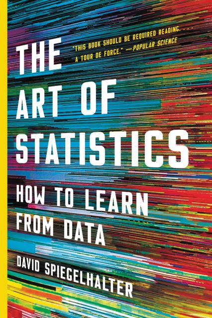
The Art of Statistics
How to Learn from Data
Contributors
Formats and Prices
- On Sale
- Sep 3, 2019
- Page Count
- 448 pages
- Publisher
- Basic Books
- ISBN-13
- 9781541618527
Price
$18.99Format
Format:
This item is a preorder. Your payment method will be charged immediately, and the product is expected to ship on or around September 3, 2019. This date is subject to change due to shipping delays beyond our control.
Buy from Other Retailers:
The age of big data has made statistical literacy more important than ever. In The Art of Statistics, David Spiegelhalter shows how to apply statistical reasoning to real-world problems. Whether we're analyzing preventative medical screening or the terrible crime sprees of serial killers, Spiegelhalter teaches us how to clarify questions, assumptions, and expectations and, most importantly, how to interpret the answers we receive. Combining the incomparable insight of an expert with the playful enthusiasm of an aficionado, The Art of Statistics is the definitive guide to the power of data.
-
"An important and comprehensive new book"Hannah Fry, The New Yorker
-
"David Spiegelhalter's The Art of Statistics shines a light on how we can use the ever-growing deluge of data to improve our understanding of the world.... The Art of Statistics will serve students well. And it will be a boon for journalists eager to use statistics responsibly -- along with anyone who wants to approach research and its reportage with healthy skepticism."Evelyn Lamb, Nature
-
"Spiegelhalter goes beyond debunking numerical nonsense to deliver a largely mathematics-free but often formidable education on the vocabulary and techniques of statistical science.... An admirable corrective to fake news and sloppy thinking."Kirkus
-
"A call to arms for greater societal data literacy.... Spiegelhalter's work serves as a reminder that there are passionate, self-aware statisticians who can argue eloquently that their discipline is needed now more than ever."Financial Times
-
"The Art of Statistics is alight with Spiegelhalter's enthusiasm .... It leaves readers with a better handle on the ins and outs of data analysis, as well as a heightened awareness that, as Spiegelhalter writes, "Numbers may appear to be cold, hard facts, but ... they need to be treated with delicacy."Sciencenews
-
"A book that crams in so much statistical information and nonetheless remains lucid and readable is highly improbable, and yet here it is. In an age of scientific clickbait, 'big data' and personalised medicine, this is a book that nearly everyone would benefit from reading"Stuart Ritchie, The Spectator
-
"This is an excellent book. Spiegelhalter is great at explaining difficult ideas...Yes, statistics can be difficult. But much less difficult if you read this book"The Evening Standard (UK)
-
"What David Spiegelhalter does here is provide a very thorough introductory grounding in statistics without making use of mathematical formulae. And it's remarkable. Spiegelhalter is warm and encouraging -- it's a genuinely enjoyable read.... This book should be required reading for all politicians, journalists, medics and anyone who tries to influence people (or is influenced) by statistics. A tour de force."Popular Science
-
"Do you trust headlines telling you...that bacon, ham and sausages carry the same cancer risk as cigarettes? No, nor do I. That is why we need a book like this that explains how such implausible nonsense arises in the first place. Written by a master of the subject...this book tells us to examine our assumptions. Bravo."Standpoint
-
"Like the fictional investigator Sherlock Holmes, Spiegelhalter takes readers on a trail to challenge methodology and stats thrown at us by the media and others. But where other authors have attempted this and failed, he is inventive and clever in picking the right examples that spark the reader's interest to become active on their own."Engineering & Technology
-
"What David Spiegelhalter does here is provide a very thorough introductory grounding in statistics without making use of mathematical formulae. And it's remarkable. Spiegelhalter is warm and encouraging -- it's a genuinely enjoyable read.... This book should be required reading for all politicians, journalists, medics and anyone who tries to influence people (or is influenced) by statistics. A tour de force."Pop Science Books
-
"In this wonderfully accessible introduction to modern statistics, David Spiegelhalter has created a worthy successor to classics such as Mooney's Facts from Figures. Using many real examples, he introduces the methods and underlying concepts, showing the power and elegance of statistics for gaining understanding and for informing decision-making."David J. Hand, author of The Improbability Principle
-
"David Spiegelhalter combines clarity of thinking with superb communication skills and a wealth of experience of applying statistics to everyday problems. The result is The Art of Statistics, a book that manages to be enjoyable as well as informative: an engaging introduction for the lay person who wants to gain a better understanding of statistics. Even those with expertise in statistics will find much within these pages to stimulate the mind and cast new light on familiar topics. A real tour de force which deserves to be widely read."Dorothy Bishop, professor of developmental neuropsychology and Wellcome Trust Principal Research Fellow in the Department of Experimental Psychology, University of Oxford
-
"If I had to trust just one person to interrogate statistical data, I'd trust David Spiegelhalter. He is a master of the art. Here, he shows us how it's done. The result is brilliant; nothing short of an essential guide to finding things out -- delivered through a series of detective-like investigations of specific examples ranging from sexual behavior to murder. The technical essentials are also all here: from averages to infographics, algorithms and Bayesian statistics - both their power and their limitations. All this makes The Art of Statistics a first call for all those setting out on a career or study that involves working with data. But beyond that, it's self-help for anyone with a serious desire to become a clued-up citizen in a world of numbers. If you want pat answers, or meat for your prejudices, go elsewhere. But if you want to develop the skills to see the world as it is, and to tell it how it is -- honestly and seriously -- this is the book."Michael Blastland, co-author of The Tiger That Isn't: Seeing Through a World of Numbers
-
"David Spiegelhalter is probably the greatest living statistical communicator; more than that, he's one of the great communicators in any field. This marvelous book will transform your relationship with the numbers that swirl all around us. Read it and learn. I did."Tim Harford, author of The Undercover Economist
-
Scott Page, author of The Model Thinker
"Some (including Einstein) define genius as the art of taking something complex and making it simple. In this equation-free, all-encompassing, and totally-understandable-by-anyone introduction to the ideas, tools, and practice of statistics, Spiegelhalter meets that definition. This book is perfect for anyone who has wanted to learn statistics but felt overwhelmed by complicated mathematical equations." -
"Spiegelhalter carefully explains everything you need to know: Are numbers bringing clarity and insight, or are they being used to promote an agenda or attract attention? In an era of 'alternative facts' and 'fake news,' this is the right book at the right time."JaneGreenhalgh, NPR