Promotion
Use code DAD23 for 20% off + Free shipping on $45+ Shop Now!
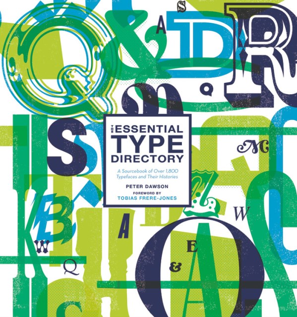
The Essential Type Directory
A Sourcebook of Over 1,800 Typefaces and Their Histories
Contributors
By Peter Dawson
Foreword by Tobias Frere-Jones
Formats and Prices
Price
$45.00Price
$57.00 CADFormat
Format:
- Hardcover $45.00 $57.00 CAD
- ebook $21.99 $28.99 CAD
This item is a preorder. Your payment method will be charged immediately, and the product is expected to ship on or around December 17, 2019. This date is subject to change due to shipping delays beyond our control.
Also available from:
Excerpt
Foundry Profiles
BB-Bureau
Colophon
Commercial Type
Dalton Maag
Emigre
Fontsmith
Forgotten Shapes
The Foundry
Frere-Jones Type
Grilli Type
Jeremy Tankard Typography
Milieu Grotesque
MuirMcNeil
Neutura
Or Type
Playtype
Typotheque
Designer Profiles
Ed Benguiat
Margaret Calvert
Matthew Carter
Wim Crouwel
Adrian Frutiger
Herb Lubalin
Erik Spiekermann
Hermann Zapf
Explore book giveaways, sneak peeks, deals, and more.
T = top; B = bottom; M = middle, L = left; R = right; BL = bottom left; BR = bottom right; TL = top left, TR = top right.
Page 2. T: Bespoke typeface for Umbro by Commercial Type for the England football team kit; BL: Promotional print for Skate Agora, using Druk by Commercial Type, design by Solo Design Studio, Madrid; BR: Editorial design by Yevgeniy Anfalov using Mineral by BB-Bureau.
Page 3. T: Identity and branding for the London-based Redchurch Brewery, employing Separat by Or-Type, design by Bibliothèque; B: Poster series by Design by Atlas for Museu del Disseny using Graphik by Commercial Type.
Page 4. Optical/geometric type system Nine by MuirMcNeil.
Page 5. TL: Albertus as used by Barnbrook studio in the book David Bowie Is; TR: Program promotional design by Emigre; BL: Lost & Foundry typeface collection by Fontsmith; BR: BB-Bureau’s ZigZag in use for Antigel Festival 2014, design by Pablo Lavalley.
Page 6. T: Preparatory workings for Dalton Maag’s Blenny font; BL: Pembroke serif by Jeremy Tankard Typography; BR: Empirica by Frere-Jones Type.
Page 7. TL: FS Benjamin by Fontsmith; TR: The innovative History type system by Typotheque employed in shop window display, design by Pentagram NYC; BL: Berthold Akzidenz Grotesk employed on architect’s Tim Mein’s website, design by Sons & Co. / Timothy Kelleher; BR: Chapeau type specimen by Milieu Grotesque.
Page 8. T: Wayfinding and information graphics by Design by Atlas for Museu del Disseny using Graphik by Commercial Type; BL: Detail showing DieseWoche poster employing Univers, designed by Otl Aicher for the 1972 Munich Olympics; BR: Habitar poster by Atelier Pedro Falcão using Akkurat Pro.
Foreword
by Tobias Frere-Jones
Looking back on the recent history of type design, it’s tempting to see a story of technology, liberating makers, and users alike. In the last few decades, the tools for making digital type became available to anyone with a computer and enough patience. Designing a typeface—let alone preparing it for the marketplace—was a lengthy and daunting task. Throughout most of the 20th century, this had been an industrial-scale undertaking (literally). It was thrilling to watch the old ways being usurped and swept away. As it turned out, that was really the smaller part of the story.
The quieter and more profound change has been in education. Those slow, onerous ways of making type were also the venue for training young designers. No school taught these very particular skills, so the young and eager would learn on the job, as they had for centuries. Techniques were closely guarded from competitors, with most designers (“punch-cutters” for many years) declining to publish any detailed guide to their craft. It was a black art, and deliberately so.
But in the digital age, access to tools begat the demand for skills. And now typeface design is a regular feature of design programs around the world, with a few schools in Europe and the United States even offering degrees or certificates in this very specialized discipline. The spread of type education has brought digital type to its more mature state. And now there are more trained type designers than at any point in history. This discipline has never been so thoroughly populated.
But the question is often posed: why do we need more typefaces? Depending on how you hear it, the question may imply not only a redundancy but an ongoing dilution: the more we make the less it means. But the opposite is true. That diversity—even in fine shades—is a source of strength. If we all used the same type, that choice would become meaningless and we’d lose a chance for expression.
We can (and should) discuss the associations the type will accrue through use: the typeface that was used for this ad campaign, this political candidate, that movie poster. But it glosses over an important point: these choices, any choices, have the chance to mean more because other designers used something else. That constant refresh of inventory is the foundation of power. As long as the flavor is distinct and the execution is sound, typefaces will support one another regardless of style. Not in spite of their differences but because of them.
Gathering typefaces from the last centuries as well as the present day, this book hopes to consider that expanding world.
Introduction
I had my first forays into working with type in my youth, when I spent my later school studies honing my skills to become a commercial illustrator. My ambition was to illustrate graphic novels. Designing posters and graphic ephemera, I used type mainly in the form of hand drawings with a liberal dash of Letraset dry-transfer lettering. At such a tender age, I was not fully aware of the existence of typeface designers or typefaces as a commercial craft and industry.
I was formally introduced to typography and typefaces during my first year of studying for a degree in Graphic Design at Kingston University, Surrey, UK, when my lecturer, the designer Eugenie Dodd, asked me to complete a typographic project. It was a momentous moment as I realized that a whole world of typefaces and their infinite possibilities lay before me. I changed tack in my studies and never looked back. Gone was my ambition of becoming a comic-book illustrator as my attentions turned to becoming a typographic graphic designer.
More than twenty-five years later, I am writing the introduction to Type Directory, having enjoyed a career that has been more like a vocation. I love my role and, more importantly, I am still learning. Over the years, I have used numerous typefaces on a wide variety of projects and have always admired the creative ingenuity, dedication, craftsmanship, and attention to detail of the unsung heroes of the world of type design. These highly skilled members of the creative community past and present number in their thousands. Many are revered as icons in the typographic world thanks to their creative genius and unassuming daily passion. What are invariably their labors of love enable those who work with type to have their creations read in print or online across the world.
Type Directory aims to pay tribute to these heroes of type by presenting a selection of the many typefaces that are available for a designer. The book is a visual celebration of the craft, innovation, and beauty of these letterforms. It is a comparative guide across a range of type styles and their subcategories, providing the historical background to their creation as well as insight into the evolution of the international industry and community that revolves around typefaces. There are now more than 250,000 individual fonts that make up typeface families, and they comprise the good, the bad, and the excellent. This collection presents a portfolio of diverse creations with the aim of being an essential and informative sourcebook for the graphic designer and design studio. Given there are so many types available, not all can be included here and inevitably there are typefaces that have been omitted but which are popular with practitioners. (Other factors are the extent, permissions, and contributions offered.) This collection comprises more than 1,800 typefaces with all manners of style, geographical location, and historical periods, as well as aesthetic appeal and practicality. Type Directory also profiles some of the world’s most innovative type design studios and their work, as well as significant type designers who have created landmark typefaces and contributed to the development of type design and graphic design.
The Type Directory is a typographic time capsule. It is by no means complete but it provides a snapshot of what has come before, shows where typeface design is now and signals the directions it is heading. Type design evolves, not simply according to fashion, designers’ interests, and aesthetic urges, but most importantly in keeping with the technological advances in how people read information in print and on screen. In recent years, there have been a wealth of highly crafted typefaces with extensive families that bridge the gap between print and online legibility, working across all media at all sizes. A number of these typefaces are commissions specifically created for brands and organizations, large and small, to communicate their position and messages, but as is often the case, the typefaces created become the visual essence of the brands.
Designing new and ever-more refined and advanced types is a perpetual benefit to all, from the largest studios to the independent designer.
About the Book
To compile the final edit of the 1,800-plus typefaces included in this book took six months of research, examination, addition, deletion, and refinement, with a further eight months for building the book and evolving the content. Many foundries from around the globe were invited to participate; sadly, several could not contribute due to commercial, logistical, or timing reasons.
Once all the classic and key historical types and subsequent variations and revivals were included, the foundries who kindly contributed their libraries were added. This has resulted in a diverse range of contemporary and highly crafted submissions. The final collection is of typefaces that work as a resource and reference point to help graphic designers in selecting typefaces for their projects, as well as acting as an encyclopedia of type development and history.
Each typeface is presented with uppercase and lowercase alphabetical letterforms along with numerals, key punctuation marks, and symbols. All typeface examples are presented at 20-point size on 22-point leading, thereby creating a direct comparison across the entire book for letter spacing, x-height, and cap height. In addition, readers can see the line length occupied by each typeface. However, because of the structure of the book and page size it is not possible on some occasions to present the whole of the uppercase alphabet. Those typefaces that appear only in uppercase will have no lowercase option and some of the typefaces possess alternate characters, so discrete differences in their letter designs or certain of the characters are shown.
A short descriptive text accompanies each entry, explaining its origin and / or significant design features. Each entry also contains a section that provides information on the foundry, the name of the designer/s, the designer’s nationality, and the type’s date of origination. Earlier dates invariably refer to metal production, whether punches or hot metal. Later dates refer to phototypesetting and digital production. The team of writers who assisted in this extensive challenge was confronted by many cases of conflicting information regarding origination credits and dates of typefaces that in some instances are centuries old and come from all over the world. The hope is that their diligence has achieved clarity and historical accuracy. Typefaces of particular value, visual interest, or innovative contemporary designs are presented as half-, single- or double-page spread features. This allows for additional information and images showcasing how they were created or their usage. At the end of the book there are several indexes to help readers locate typeface entries: an A to Z index of typefaces, an index of typefaces by designer, and an index by foundry.
Glossary
Anti-aliasing
The addition of intermediate pixels (especially on curves) on screen, where bitmapped type possesses stepped pixels to create smooth transitions by blurring the edges.
Antiqua
A classification or grouping of serif types with calligraphic Old Style letterforms. Used as a German and Scandinavian common name for serif types.
Aperture
The opening of a part-closed counter, such as “C” and “S,” or the upper half of a lowercase double-storey “a.”
Apex
The point where two strokes meet at the top of a letter, such as on an uppercase “A” or “M.”
Arc
Any part of a curve of a letter, leading into a stem.
Arm
The horizontal stroke in a character that does not connect to a stem at one side such as on an “E,” or on both sides such as a “T.”
Ascender
The vertical stroke or feature of a lowercase letter that rises above the font’s x-height, as in “b,” “d,” “f,” and “k.”
Axis (stress)
A key feature of most typefaces, an invisible line that runs through the character, from top to bottom, through its thinnest points, creating direction in its form. This assists in classification, with Old Style typefaces having a slanted axis and transitional types having invariably a vertical stress.
Back slant
A reverse italic / oblique with a left tilt or lean.
Ball terminal
A circular rounded shape found at the end of a stroke instead of a serif or a sharp cut-off. To be found on lowercase double-storey serif letters such as “a,” “c,” and “f.”
Baseline
Invisible line on which all lower- and uppercase letters sit.
Beak
A decorative pronounced stroke, similar to a serif, found at the end of the arm of a letter, such as capital “S.”
Bitmap
Character or form defined by pixels set within a grid. What was a part of PostScript fonts containing information for the typeface to display correctly on-screen on older computer systems that had no rasterizing capability. Also referred to as “screen fonts.”
Blackletter
A classification or grouping of heavy calligraphic script types, also known as Gothic Script and Old English script, employing broad-nibbed uniform vertical strokes connected by angular lines. Created from the Middle Ages onward and used commonly for manuscript books and documents throughout Europe at the time.
Body
The full height of a typeface including ascenders, descenders, and clearance space. The height of the body is equal to the point size.
Bold
A heavier drawn variation of a regular weight of a typeface.
Bowl
The enclosed rounded / oval form found on letterforms such as “b,” “o,” and “p.”
Bracket
The curved or wedge-shaped element found between the serif and the stem that joins them together.
Calligraphy
The craft of writing elegant letterforms by hand using a writing tool.
Cap height
The height of a capital or uppercase letter from its baseline to the letterform’s highest point.
Capital
A large set of initial letters. Also referred to as “uppercase” and “caps.”
Character
Any individual letter, number, punctuation mark, symbol, or sign within a typeface.
Color (typographic)
The tonal value of a block of text when it is set on a page. Referred to in shades of gray to black.
Condensed
Typeface appearance designed with a narrower character width over Roman types.
Constructivist
Russian 20th-century art and architectural movement, influenced by Cubism and Futurism, and which was an influence at the Bauhaus schools in Germany.
Contrast
The difference between thick and thin strokes of a character design. Can also be referred to in terms of size, color, and weight of differing types.
Counter
The enclosed or partially enclosed negative space within a letter, such as in “b” and the lower part of “e.”
Cross stroke
The horizontal strokes across the stem found in lowercase letterforms, such as “t” and “f.”
Crossbar
The horizontal strokes found in letterforms, such as “A” and “H.” Also known as a “bar.”
Crotch
Inside angle where two strokes join, such as in a “V.”
Cursive
Type reminiscent of handwritten letterforms. Also known as “script” or “longhand” with characters joined up.
Descender
The part of a lowercase letter that sits below the baseline, such as on a “g” or “p.”
Didone
A serif family that possesses very high stroke contrast with unbracketed hairline serifs. Also referred to as “modern.”
Dingbat
A non-alphabetical character consisting of a symbol, shape, or other pictorial element.
Display
Typefaces designed for title or headline applications rather than for reading texts. Commonly used in advertising or banner applications, often decorative and used for larger settings rather than the setting of extended lengths of text.
Double-storey
Lowercase “a” and “g” that possess two counters over each other. Single-storey types have just the one.
Drop shadow
Creation of an offset replication of a letterform positioned behind a character to provide a 3D effect or shadow design.
Ear
Decorative flourish found on a lowercase double-storey “g” on the upper right of the top bowl.
Egyptian
Serif type with low stroke contrast and large, heavy, squared serifs.
English roundhand
Calligraphic connecting handwritten script originating from England in the mid 17th century. Features include a low stroke contrast as drawn with metal pointed nibs.
Expanded (extended)
A type design whereby the letterforms are created as if stretched across the horizontal axis to make wider character widths than in a regular design.
Expert
A reference for a font that possesses an extended character set such as non-aligning numerals and other alternative characters.
Eye
Specifically the counter within a lowercase “e.”
Family
A collection of fonts of varying weights and styles sharing a common design approach and construction.
Fat Face
Heavily emboldened serif display typefaces. The earliest recorded designs were in England during the early 19th century, where they were used for posters and lottery bills.
Figures
Alternative name for numbers and numerals.
Finial
A tapered or curved end to a stroke.
Fleuron
Decorative typographic ornament such as a flower or botanical symbol that is placed at the beginning or ends of paragraphs.
Font / fount
A collection of all the letterforms, punctuation marks, numerals, and font metrics attributed to a single typeface design and weight such as Roman. A typeface family is made up of several fonts, each of its own style and weight.
Foot
The element of a stem that sits on the baseline.
Foundry
The historical name of a place used for casting hot-metal type. It is employed today to describe type studios.
Fraktur
A form of decorative blackletter type, commonly found in Germany from the 16th century and widely used there until the mid 20th century.
Glyph
A single character (number or letter), punctuation mark, or symbol within a typeface.
Grotesque
From the German “grotesk”; a type classification of sans-serif typefaces.
Hot metal
A process that involved the injection of molten metal into a cast formed of differing glyphs to create type blocks (slugs) to be used for printing, when inked up and pressed into the paper. Developed in the late 19th century, it fell out of fashion for mass-market printing with the appearance of phototypesetting in the late 1950s. It became obsolete with the advent of digital processes in the 1980s. Also known as “mechanical typesetting.”
Humanist
A classification of serif and sans-serif typefaces based on calligraphic minuscule letterforms dating to the 7th and 9th centuries and the proportions of the Roman capital.
Ink trap
A feature within a typeface’s design where counters and corners of letterforms are removed to counter the build-up of ink when printed, negating dark spots, especially if material is of a low quality such as newsprint.
Italic
A slanted, script version of a Roman typeface; a bespoke design incorporating distinctive and individual letterforms that appear handwritten. More often found in serif designs. See “oblique.”
Italienne
Decorative display type inspired by the large wood type of the American Wild West identified by large, heavy banded serifs and extreme contrast in stroke weight.
Junction
Intersection at which the end of one stroke meets a point in another stroke in a letter.
Kerning
The spacing and plus / minus adjustment between individual pairs of letters to improve readability and appearance.
Leading
The term dates to the use of metal type when compositors inserted thin strips of lead between lines to increase line spacing. Traditionally, it refers to the adjustment and addition of vertical distance between lines of horizontal type, expressed in points, fractions of points, or millimetres. Today, the term is widely used to describe line spacing.
Leg
The downward sloping stroke on a “k” and “R.”
Legibility
The ability of one letter to be easily distinguished and recognizable from another.
Letter spacing
The adjustment of space between letters in typesetting, either uniformly or optically, to achieve optimum positioning.
Ligature
Two characters joined to form one letterform such as “fi,” “ff,” or “fl.”
Light
A thinner drawn variation of a regular weight of a typeface.
Line spacing
The vertical distance between lines of horizontal type, expressed in points, fractions of points, or millimetres. Measured from the baseline of one line to the baseline of the next.
Lining figures
Numeral characters of common size and cap height resting on the baseline.
Lithographic (litho) printing
Printing onto paper from inked etched metal plates. The most common form of printing worldwide today. It is used for the printing of books, catalogues, and posters due to its high quality.
Loop
Genre:
- On Sale
- Dec 17, 2019
- Page Count
- 672 pages
- Publisher
- Black Dog & Leventhal
- ISBN-13
- 9780762468171
Newsletter Signup
By clicking ‘Sign Up,’ I acknowledge that I have read and agree to Hachette Book Group’s Privacy Policy and Terms of Use